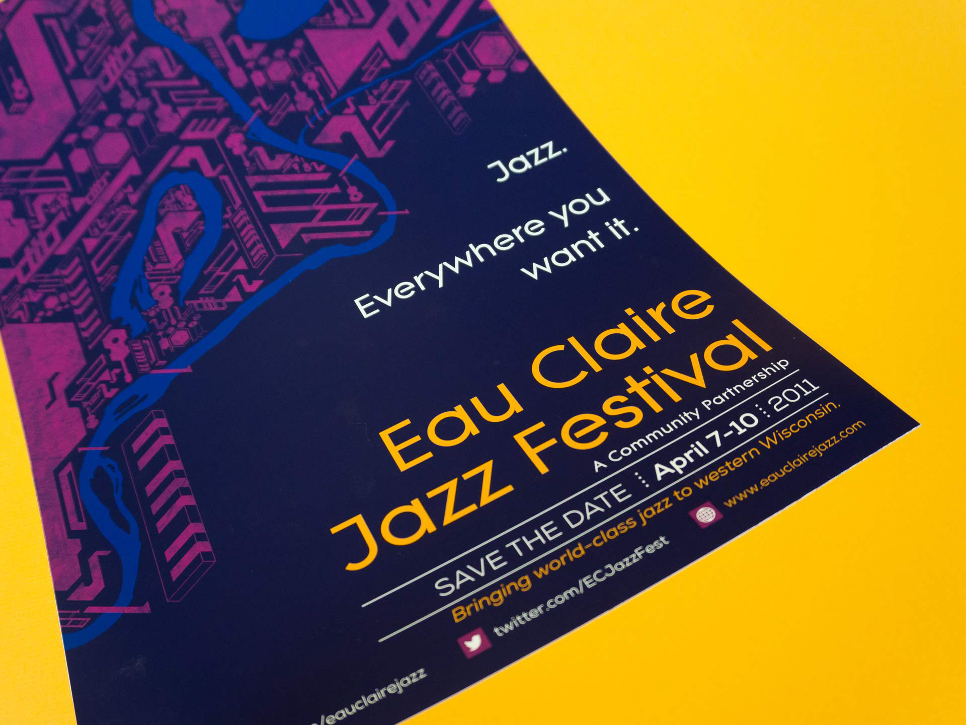
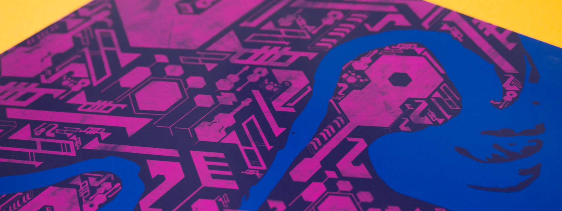
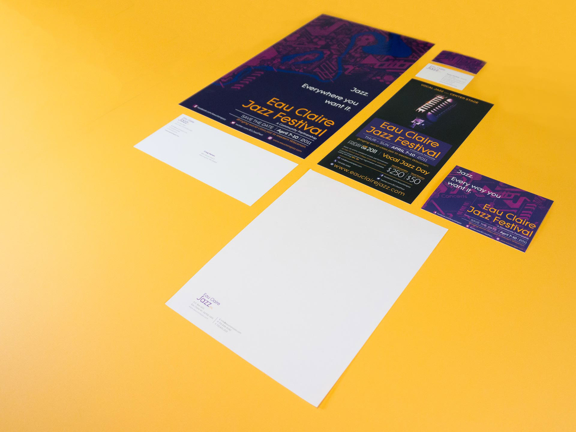
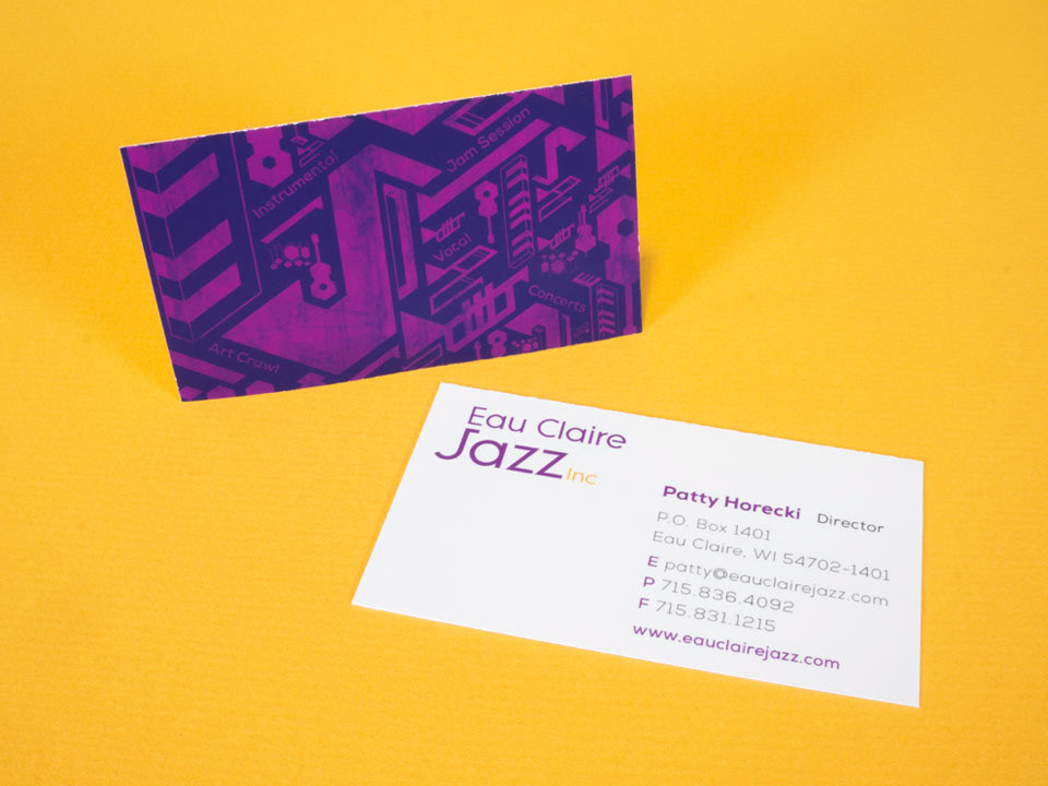
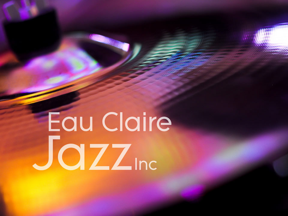
I worked with Eau Claire Jazz Inc to develop a visual language for the company itself, as well as the Eau Claire Jazz Festival it hosts annually. In branding the Festival itself, I wanted to capture the dynamism of jazz and created a set of instruments based on a diagonal grid system. Using this system of instruments, I created promotional materials, including ads of various sizes, posters highlighting the city as an epicenter of jazz in the Midwest, as well as letterhead, business cards, and more.
The logo is tied to the identity through its typeface, Litera, a geometric sans-serif with clear references to basic geometric shapes (circles, triangles, rectangles). This was deliberate to directly connect the two entities. The typeface is a modern take on art deco typefaces, tying it to jazz's heyday, communicating that the festival has music for both classic and modern jazz aficionados.