Bella and Myles, Coconut Whisk's founders, started the company in their college apartment to make vegan baking a joyous experience. The challenge was to extend that joy into their visual system, while also expressing their social mission to benefit children and animals. My work included redesigning their logo, establishing their typography system and color scheme, and their packaging.
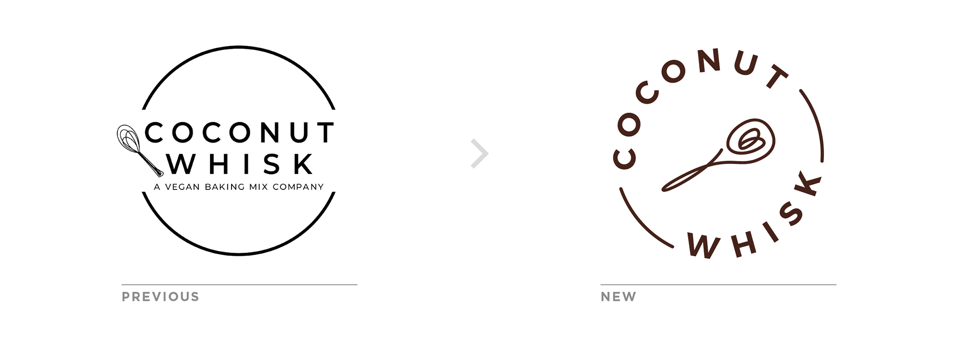
I began by simplifying their logo. The circular form symbolizes connection and togetherness, while also alluding to an open coconut. Using the letterforms to create the bulk of the circle reduces unnecessary line work, while also activating the form. The whisk has also been reduced to a single stroke to read more clearly, while also inserting a heart in the center, marking Coconut Whisk as a true labor of love.
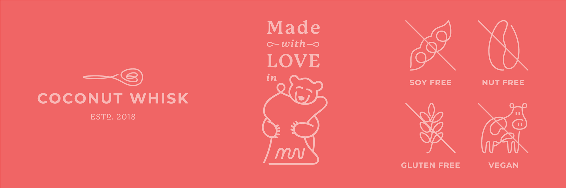
The brand required additional marks, including a horizontal logo lockup and icons to quickly communicate Coconut Whisk's products features. These use the same single stroke approach as the whisk icon.
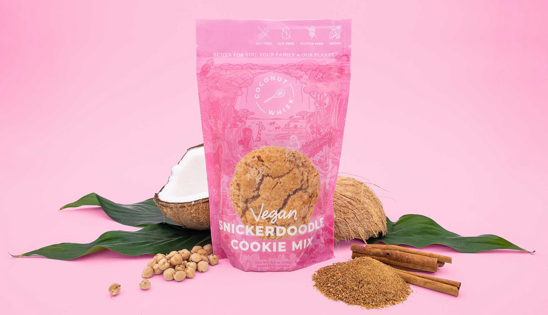
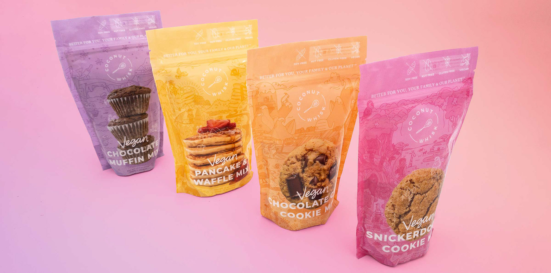
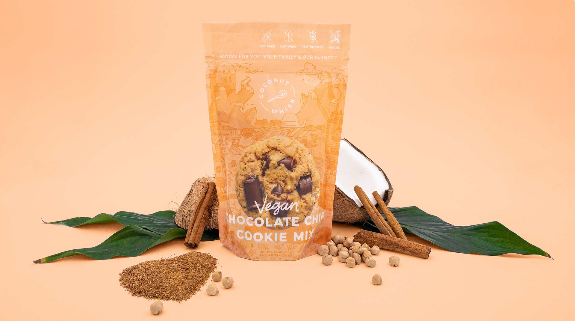
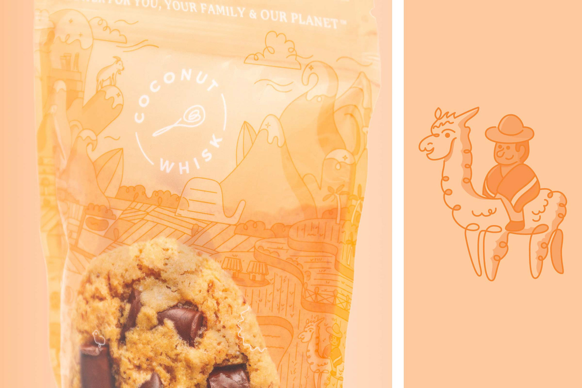
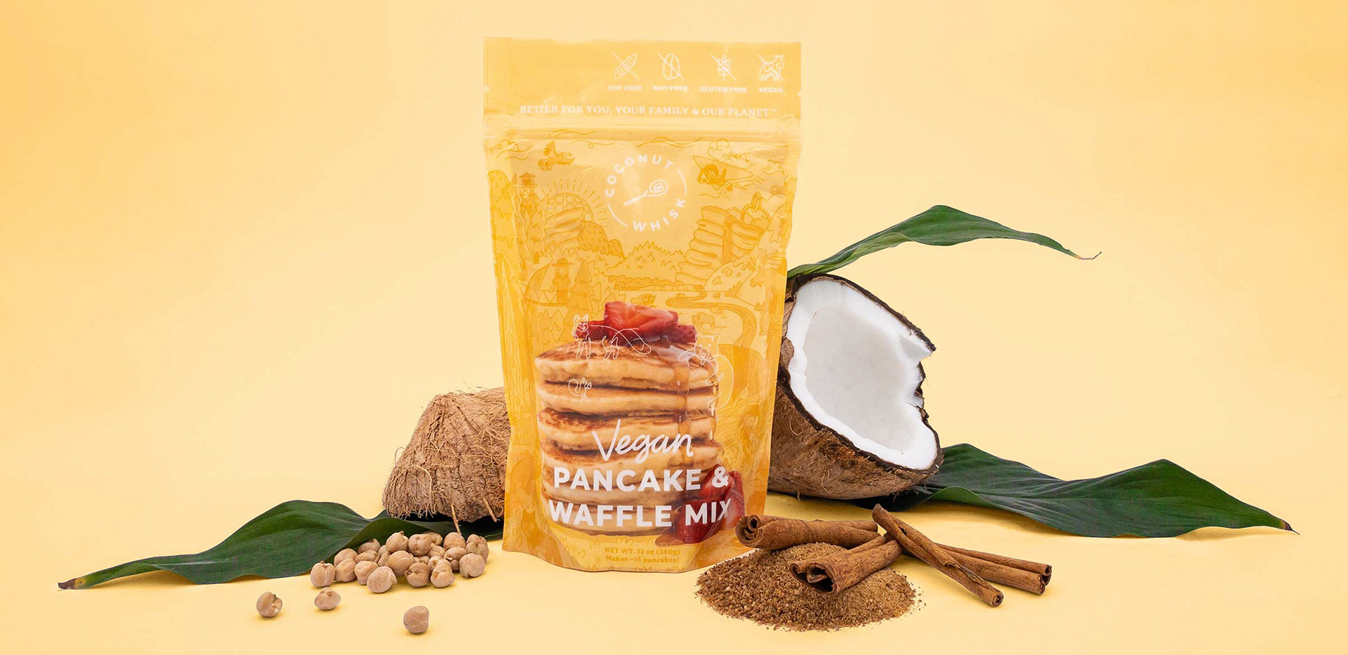
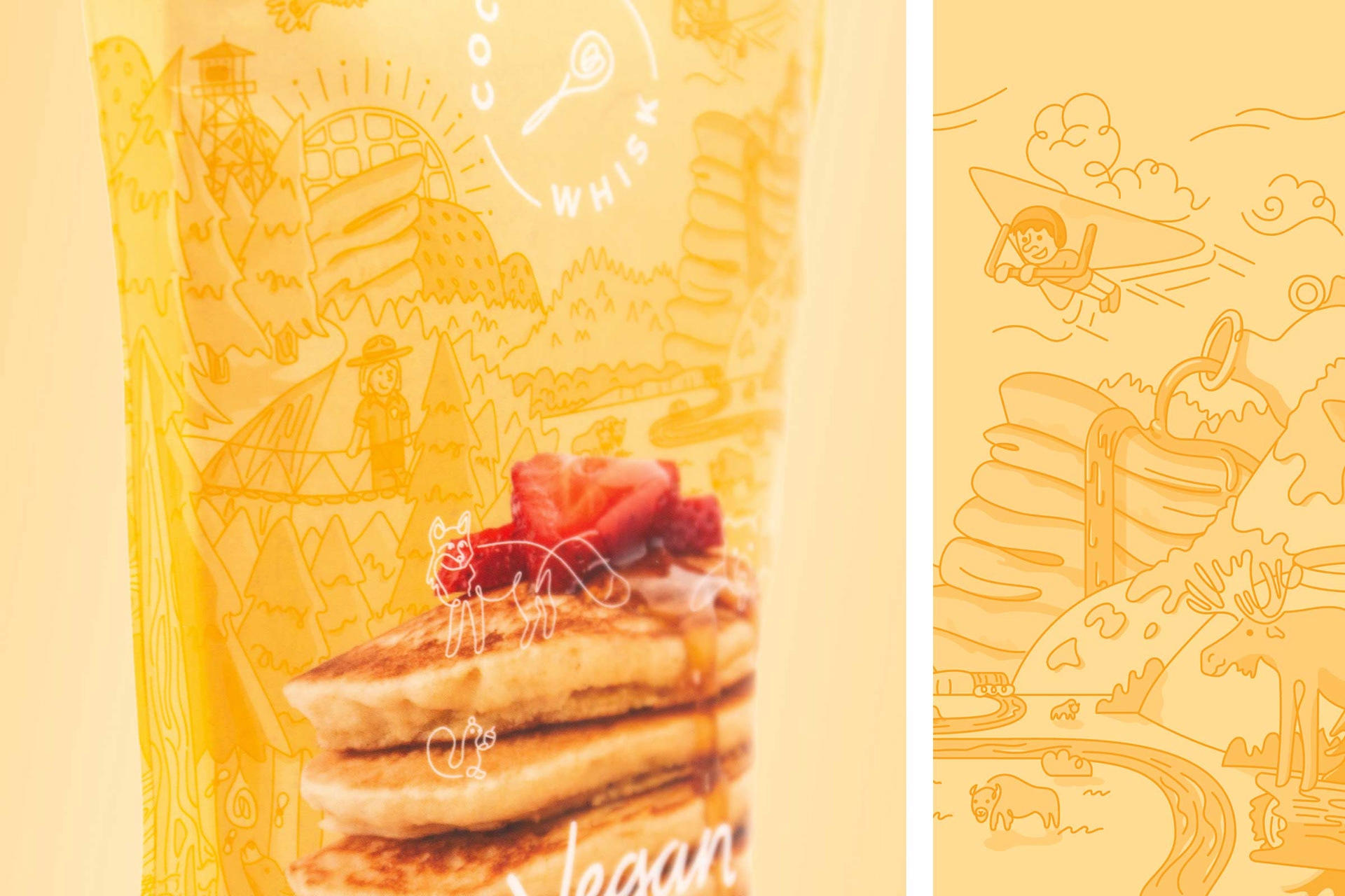
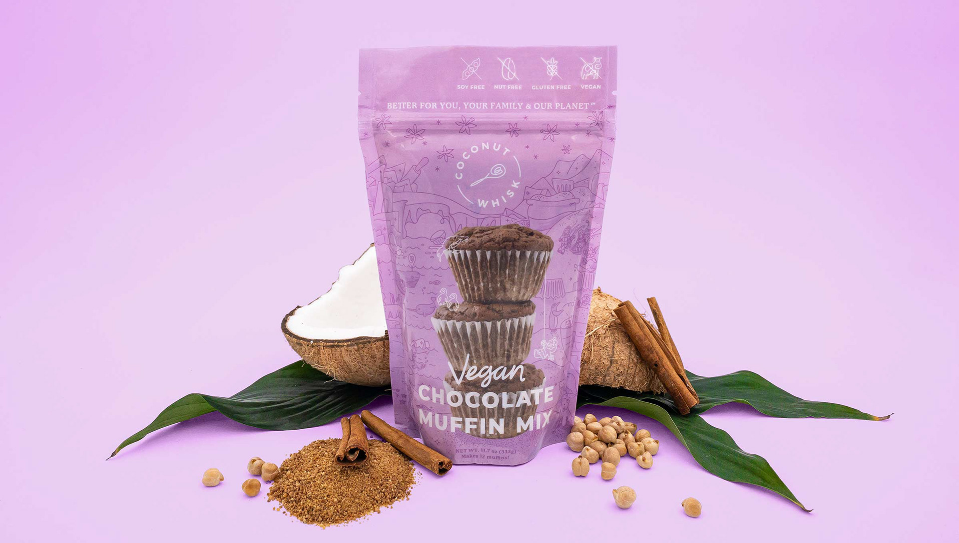
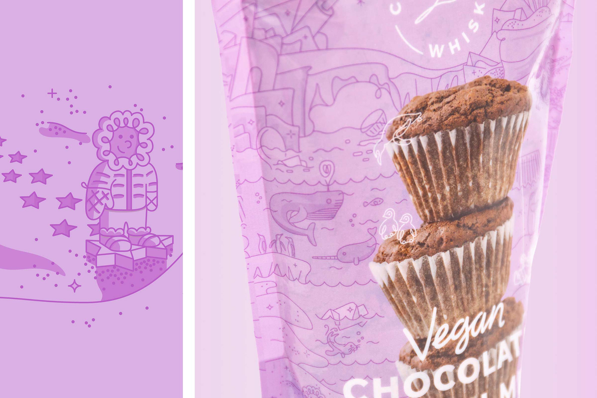
Each pouch features a different type of environment: jungle, farm, forest, and arctic. Each has its own key color and monochromatic color scheme to clearly differentiate from one another and allow the product image to stand out amongst the complex illustrations. The same single-line approach carries through, creating a sense of movement and exuberance and connecting the visuals clearly to the logo. Children and animals appear throughout, clearly expressing their vision to benefit both around the world.
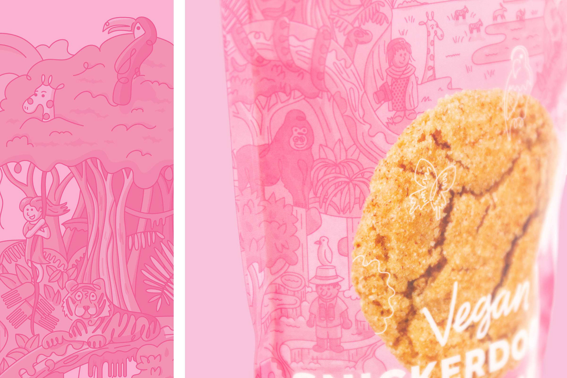
Humorous moments are peppered throughout, expressing both whimsy and joy. It was a lot of fun hiding references to baking utensils and the ingredients throughout the illustrations, turning the packaging into a sort of game for the viewer. Cookie cutter snowshoes, oven mitt mountains, pancake cliffs with syrup waterfalls, the list goes on!
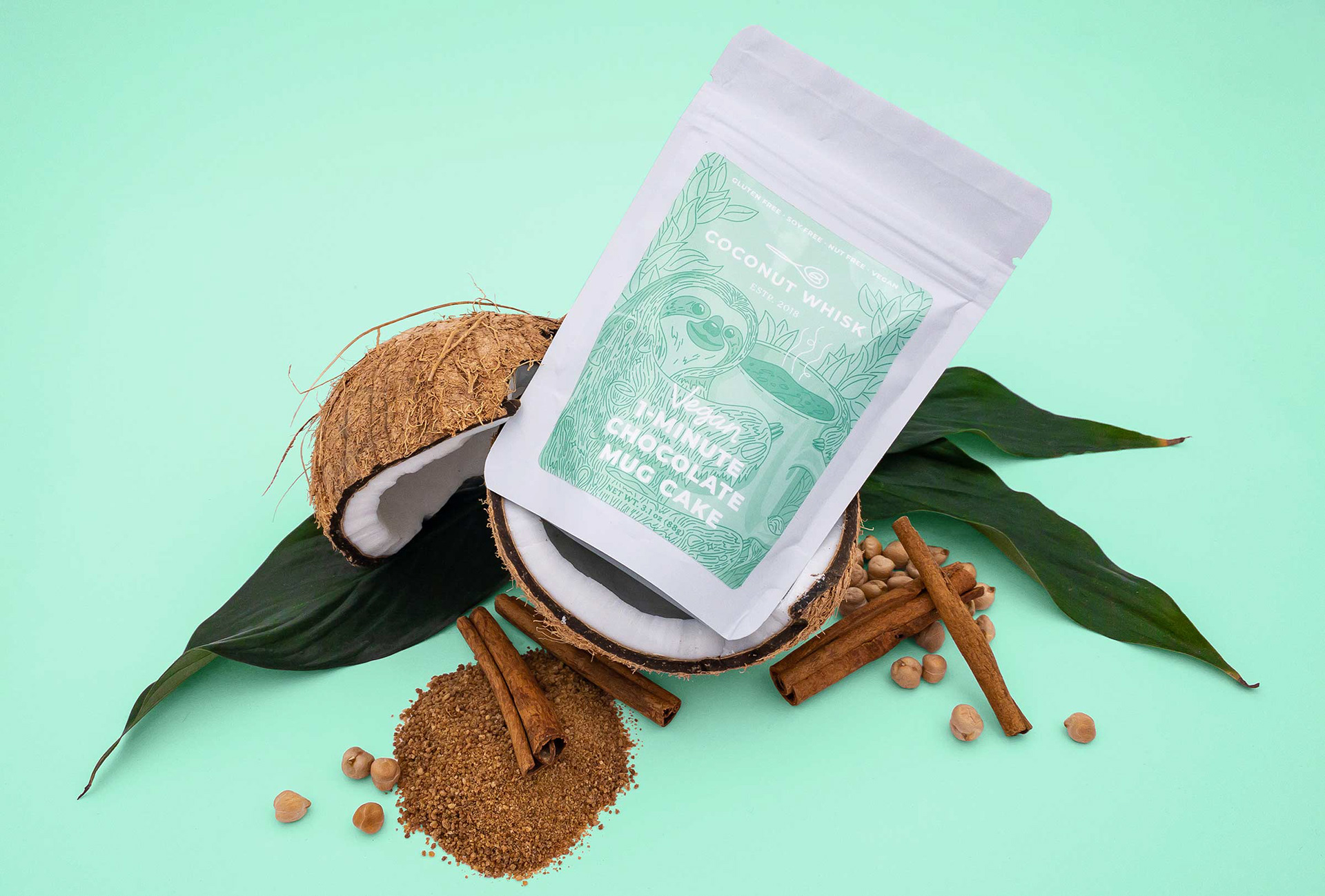
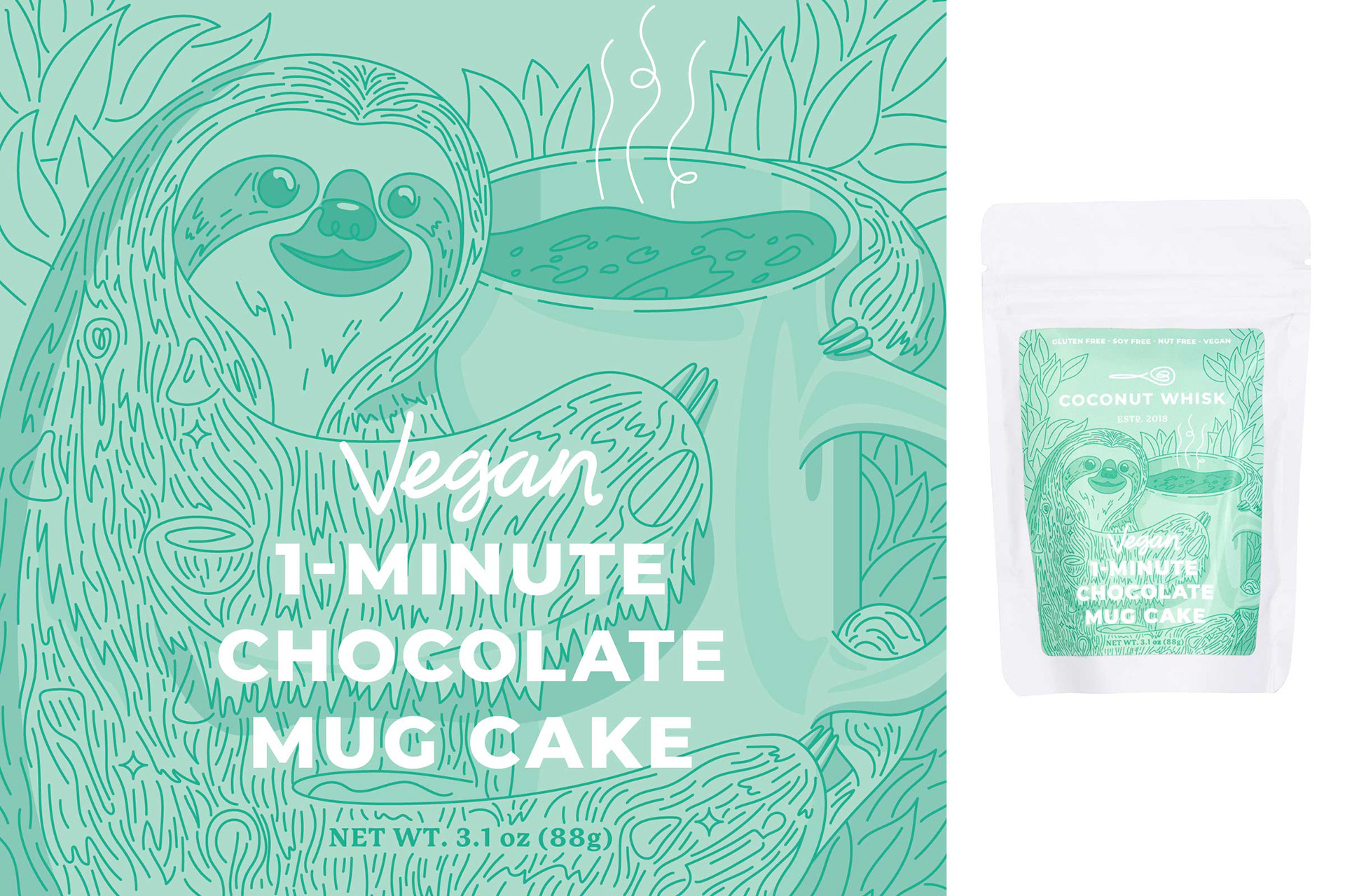
The mug cake package had to take the form of a label due to budget constraints, so I opted for a more focused illustration featuring a sloth giving a mug a big hug. Check out his hair for more hidden objects.
As happy as I am with how this project turned out, it wouldn't be a success unless it accomplished its goal: to express the joy that using Coconut Whisk's products can bring and increase sales. Happily, once the new packaging hit stores, they immediately had their best month of revenue ever and the future looks bright for Coconut Whisk.