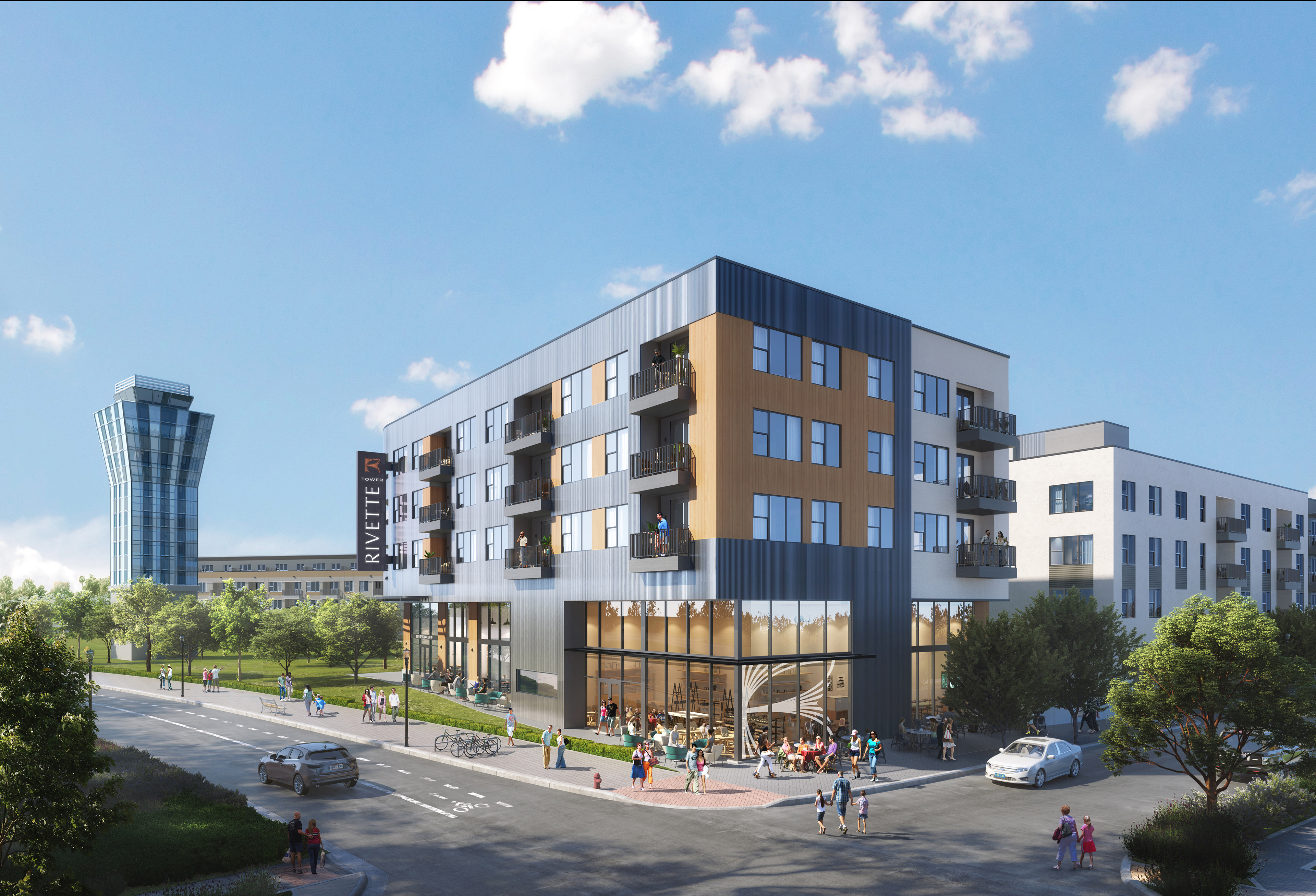
Given the chance to develop high-end apartments in one of the most desirable areas of Austin, TX, Greystar and Ryan Companies knew they needed to capitalize on this exciting opportunity to add to the city’s growth. Ryan and Greystar wanted their multifamily project to appeal to young professionals and active empty nesters who wanted to downsize. The brand of the development needed to reflect luxury yet feel grounded…a place that felt both timeless and chic. To achieve these goals, the developers engaged the Yellow Truck Creative team to name and brand the multifamily project.
The site also has a unique history; it was formerly Mueller Airport, a midcentury architectural darling with an iconic control tower still standing today. The inverse scalloped awning’s curving forms complemented the control tower’s tapered silhouette as Austin moved into the jet age. Since the control tower will be a prominent visual on the site plan, our partners wanted to pay homage to the site’s history without overt aviation iconography.
My task as the lead designer was to honor the legacy of the function and style of the airport without being heavy-handed, feel grounded in the Austin landscape while avoiding cliches, and capture the sophisticated, amenity-rich nature of the buildings in an approachable way.

Our team conducted extensive research, gathering historical photos and materials, examining the competitive landscape, and reviewing name availability to ensure whatever we pitched would stand out in the market.
We delivered a name, brand narrative, brand attributes, and brand system that includes multiple logo configurations and color options, color scheme, typography system, brand guidelines, and sample brand applications.
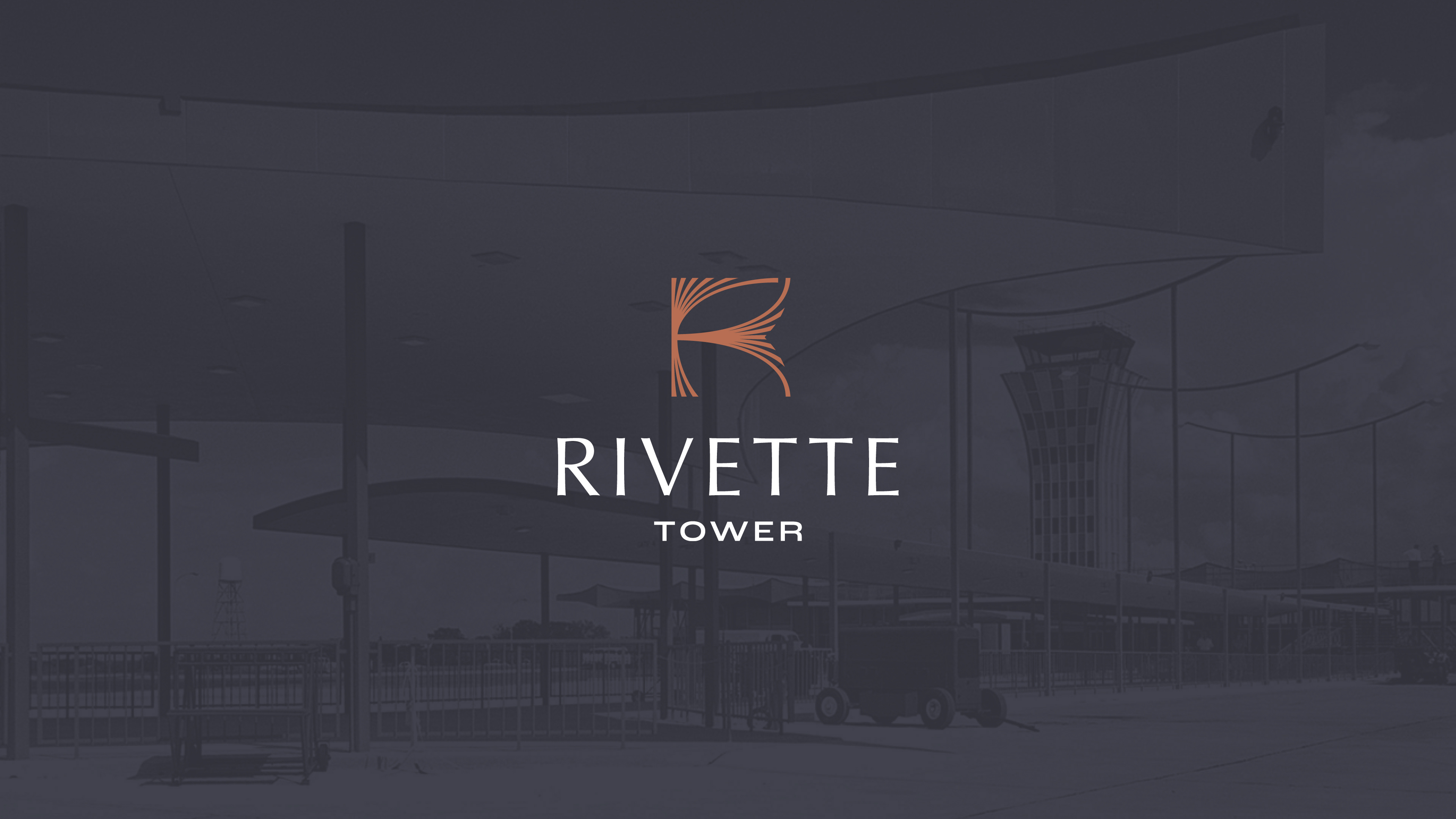
“Rivette” comes from the word “rivet,” a metal fastener often used in aircraft construction. “Rivet” also means to fascinate or hold attention firmly. Much like when you hear a great story, you’re simply captivated.
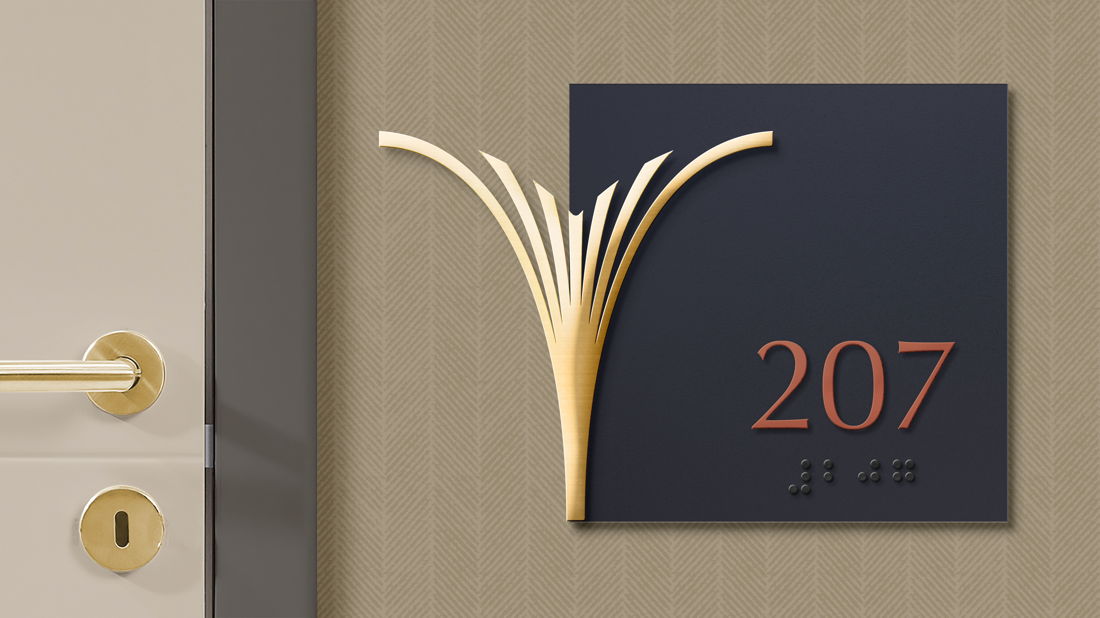
Rivette Tower’s brand icon features tapered strokes that converge to a single point, representing the unique opportunities for connection and community at Rivette Tower. The curved lines in the icon evoke the lines in the Mueller Airport control tower and architectural details found throughout the airport. The icon is also a nod to the native prairie grasses and river systems found throughout Texas, grounding our brand in its environment. Lastly, the forms create a unique and ownable “R” that allows the mark to stand alone. The wordmark features a similar tapered look, with a midcentury modern-inspired subhead.
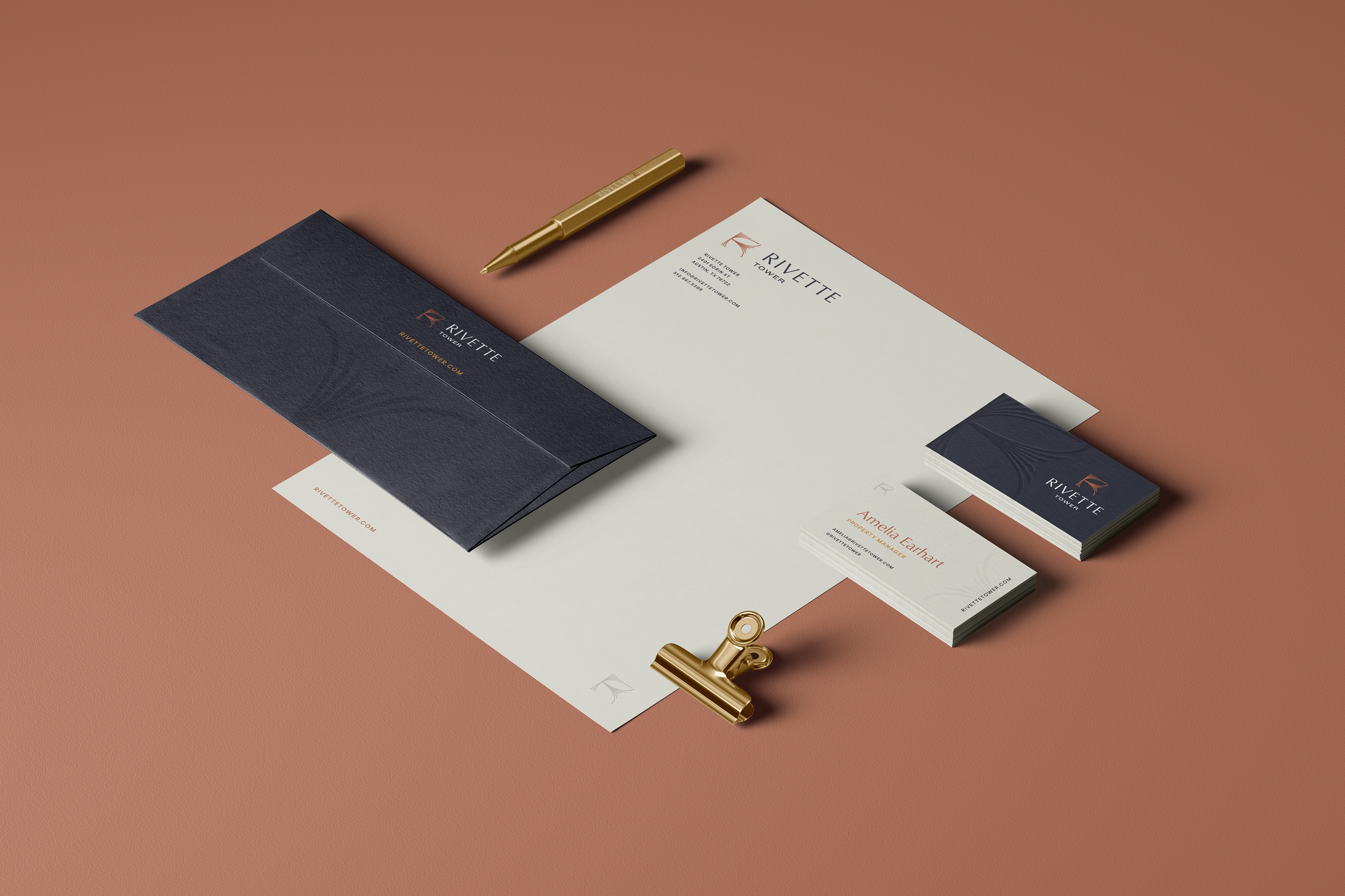
The Rivette Tower color scheme references various metals, such as copper, gold and silver. This is grounded in the history of Mueller Airport and the rivets that inspired the Rivette name. The scheme embodies the primary brand attributes of the Rivette Tower brand as a whole: refined and luxurious, confident yet approachable and a dynamic look that stays grounded and relatable.

Our clients were thrilled with the results. Rivette Tower had a brand that stood above its competitors and gave a clear vision of what prospective tenants could expect from the property before they even laid eyes on it. With the brand in place, our client is confident they’ll quickly lease up the property.