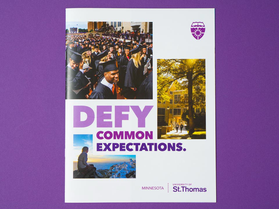
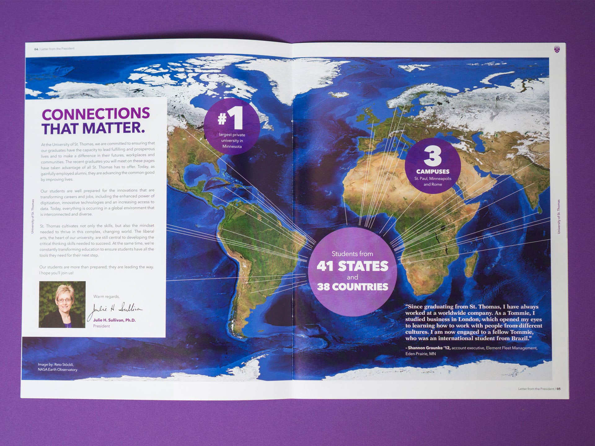
Rebranding a university is like walking a tightrope; you have to have alignment from many different stakeholders like students, faculty, donors and beyond. You’re also dealing with a crowded marketplace. To stand out, we worked with Mindpower to create a bold, crisp and authentic identity that captured the essence of what makes St. Thomas special. I designed the university's viewbook, various other high-profile admissions pieces, an iconography system, magazines, vehicle wraps and more.

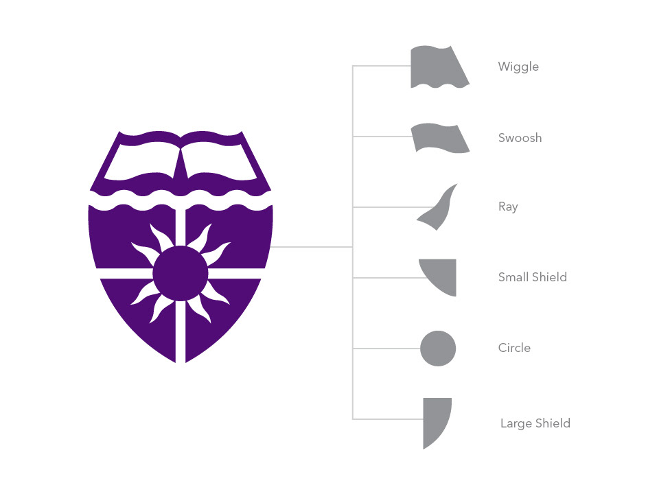
The iconography system was developed with 3 things in mind: to be flexible, own-able, and feel cohesive with the rest of our assets. With that in mind, I looked to our logo. I broke it down into shape elements which, along with the brick pattern inspired by campus buildings, used them to inspire the icons. These shape elements appear throughout the icons, providing both geometric and more curvilinear shapes to give the set flexibility. They also stay avoid the trend of single-weight line icons to give St. Thomas something unique.